Summary
During my time at Cincom I had the tremendous opportunity to spend much of my time with my design manager updating, fixing, organizing and innovating our design system “Quadrant” and its many design elements and components. While also collaborating with other internal teams to uphold, maintain and create our standards and design laws for each product line.

Problem
Within Cincom’s multiple product lines with very distinct layouts many inconsistencies surfaced while products were being delivered and updated globally. Development teams had been without a UI pattern library for a long time. These teams needed to be provided a set UI Library for them to reference for guidance. The lack of reference and set standards in the designs was needed to maintain consistency across all channels.
Action
To address the problem, an analysis of current products and past design standards was conducted. This involved cataloging existing colors, typography, UI patterns, and interactions. After identifying inconsistencies, findings were shared with stakeholders to secure support for a unified design system.
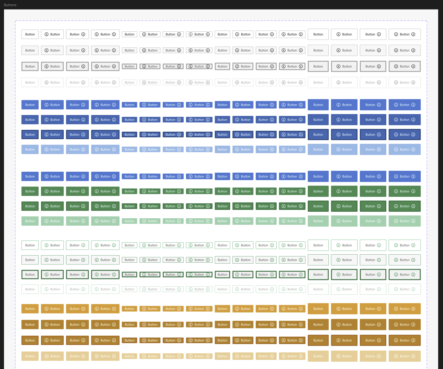
Working with global marketing, foundational elements like typography and brand assets were documented first. Next, button patterns and interaction states were defined, followed by form input patterns such as date pickers, radio buttons, checkboxes, and validation rules. As the project progressed, these assets were centrally published on platforms like Zeplin and Figma, ensuring easy access for developer handoff.
The largest contributions I made was the integration of three things:
Sections and Cataloging: Within the design library it was one of the ways of organizing a lot of our different screens and components so our design team and engineers would better understand all the layers each component belonged to when we handed them off in Zeplin.
Innovation of Components: The innovation of components was made so they could be self sufficient while also being more simple to use for our other designers and engineers through making components with built in variables, conditions and behaviors when interacted during our prototypes so the product team and engineering team can gauge page functionality
Microsoft and Non Microsoft styles: This was another element in the design system that needed a lot of revamping and updating. Alongside my design manager we tackled this task for every single component from button to radio buttons states in order to make sure our components and elements appeared cohesively across different browsers and spacing configurations.

Result
Development and product teams now have a single source to reference for Cincom’s design components and patterns, resulting in significantly improved product consistency. In addition, these design system patterns were added across other Cincom product lines and teams such as marketing who have adopted these patterns too, supporting a more cohesive customer experience from marketing through to product.

Lessons Learned
During my time at Cincom helping maintain a design system was a tall task that came with a lot of good learning experiences. Like any evolving system, it grows with each new feature, idea or iteration. The design system requires constant care and attention on a day to day basis. Fundamentally, it strengthened communication between user experience, development, and product teams. With everyone working within the same standards and system we were able to deliver clear and consistent user experiences across all products.