

Mirror Case Study
Tools: Figma, Miro
Role: UX Designer
5 Weeks
Mirror started back in 1994 as a clothing store targeting an audience looking for cheap clothing for any occasion, along the same wave that brought us Old Navy and H&M. The quality is good and the prices are low. Their main ideal is to make any type of clothing accessible to everyone. They believe clothing doesn’t have to be expensive to last forever. Mirror is very successful offline. They have over 400 stores around the world in 32 countries. Consumer perceptions around their stores suggest an experience that’s not fancy, but clean and well taken care of.
Problem
Mirror is a large chain clothing store that needs to take their business online. They want to start with a new logo and responsive e-commerce website where they can sell their products online. As well as not keeping anything they currently have so its basically a project from the ground up.
Research Goals
We want to know what users' online shopping preferences are so we can create a seamless and easy to use website and app that would encourage users to purchase products.
Competitive Analysis
I conducted a competitive analysis to find out and learn from our competitors on how to successfully launch a successful website. From any features or a certain layout and use that as inspiration to create an shopping experience.

Interviews
Number of participants: 4
Gender: 2 Males & 2 Females
Age: 24-29
Summary:
Female participants preferred a more minimalist layout than the male participants. The male participants found preferred a website that was more straightforward and to the point of buying certain items in comparison to the female participants who were interested in everything the website had to offer. Among both male and females they preferred the Uniqlo and Zara pages than the other competitors.
Persona

Similarity Matrix

Site Map
The sitemap was the key in this phase 1 project to get a general view on how this app and website would function with also implementing it hand in hand with the user flow to help mold this project.

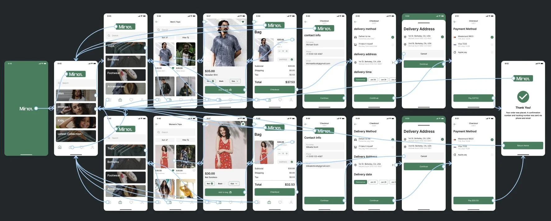
User Flow
The user flow was key in that I wanted to demonstrate a preview of what shopping and checking out an item would be like so with this user flow I tried to capture that experience.

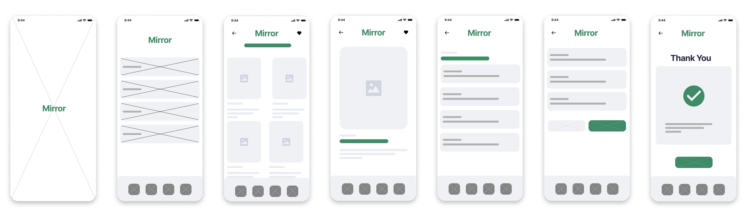
Low Fidelity Wireframes
High Fidelity Prototype & Usability Testing
Affinity Map
The usability test helped shape how I could visually improve on the experience and understand the feedback from a more visual standpoint.

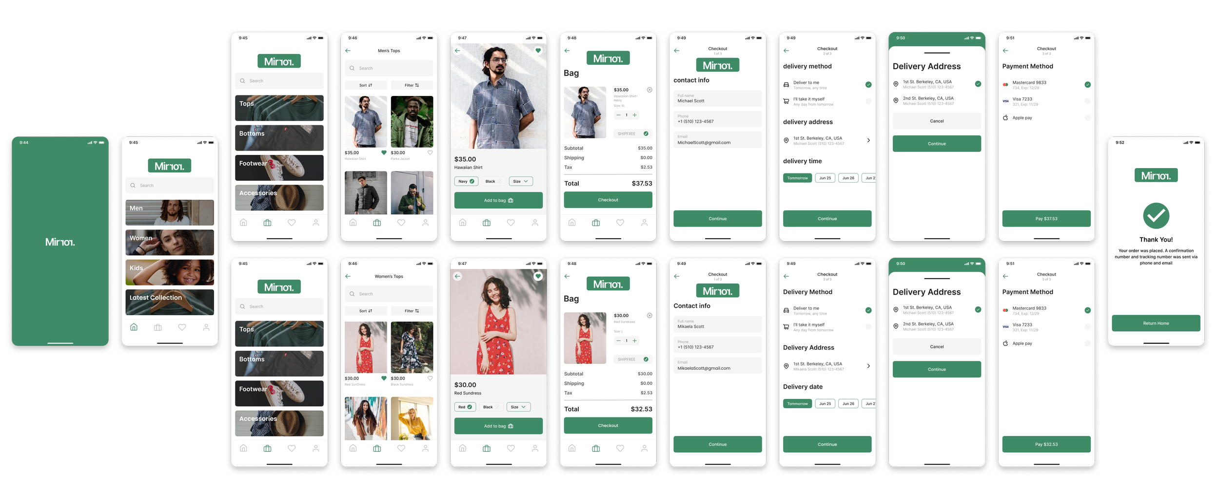
High Fidelity Wireframe
The priority in creating the high fidelity wireframe was to follow through the shopping experience of this app and mirror as a whole. And the best way to do that was through a more user flow centric experience where both men and women can add one item to the car and complete the whole checkout process.
Conclusions
Project of this magnitude rely on months of refinement and polishing however, with the timeline of about 3-5 weeks working on every aspect of this app I think it’s headed in the right direction
More usability testing to understand user preferences and enhance their experience
This project took a lot of effort but it was very rewarding for being my very first big project.